Thursday, 25 March 2010

Porfolio Binding

It has been a mega crazy week, with the amount of work on the plate so have tried my best to get something up for the blog:

A3 POSTERS: I have not completed any of the posters because after speaking to team leaders from the other groups and other group members. I was told there is suppose to be a definite theme for the design? I had no idea if this was just based around the theme of the exhibition itself or one chosen by the team leaders. So did not want to carry on if my designs would have to be later overhauled.

Thinking about the design for my portfolio, how my work will be bound together??


I did some research online and found there are loads of way to have work bound, i originally only knew it could be ring bound. A binding which looks very presentable but will not allow work to be added or taken away if needed.

I stumbled across a video on an airbrush artist i follow, how he displays his work. It is simply in a folder with sheets, he also mentions its good to have a place for your CV, business card and any flyers you might have to give to the client. (A great piece of advice.)
http://www.youtube.com/watch?v=0kXYTJL-yS0&feature=related

Printed Book Look
I found that most professional designers will get a magazine/book printed and held together with staples our thermal bound. This looks really professional, I love the look of the pages and the overall design, as it keeps the portfolio to a minimum and you instantly look at the work (which is what you want.) The only problem is that you could not take out and remove work and due to being a student allot of work will change very quickly. But it might be worth having a go?


Screw Bounded Portfolios


I looked at screw binding folders, they are brilliant products. Basically held togtether with screws which can be done and undone to add more work and take it away. Very presentable and professional looking. But they are not cheap about 60 quid, I then realised it would be nice to have a folder like that but is it worth 60 quid. At the end of the day my work should do the talking no the folder its inside!! I found loads of arguments for this from people online, so I knew it wasnt just me...

"Keep it simple and let the work do the talking. if the interviewer comments more on how the portfolio is housed than what the work is like you've done something wrong.

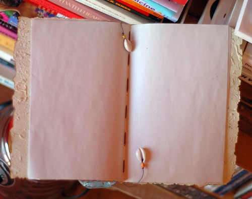
Needs to be Cheaper and made at home....

I then started to look at ways to create a cheap portfolio at home, Mariana had shown us that saftey clips can be used. So I started to think about maybe using string? Hole punching each page and looping the string around the pages and typing it on. (It could also be colored, with my fantastic airbrush skills.) Below is an example I found online:


I will try to do some experimentation next week, working with the materials I have spoken about. Also start designing the pages and how they will show the work and in what order the work will be presented....

Tuesday, 16 March 2010

Sketches for Locations

Now that we had more information about were the exhibition would be held, being 3 main spaces.

1. Inside 2 large shops, one opposite Gregs and other where specsavers was located.
2. In the middle of high chelmer where beauty stands normally reside.
3. An Aisle, the smallest of all 3 places. Normally used by AA and Sky sellers.

We had to consider all 3 scenarios as we will not know for sure until the time is too late.

My task for this week was to carry on making paint splats (As shown in my last post) and me and John were to sketch or design what each place could look like. With all the new ideas and regulations that have to be in place.

Designs for the Lage Shops


Above is my sketch for how the shops would look, they are about the same size. So I used the shop that I have taken pictures from earlier in the project. I have shown how we will cover the walls and windows in news paper and then have our work displayed over the top. I have displayed how all the props etc must be sectioned off due to health and safety, they may also have boards explaining More information.

Basically we can use most of our initial ideas if we are allocated this space, we are allowed to put things on the floor as long as they are sectioned off and not in the walk ways. We can have elementes on the walls and pillars. This is the best situation as we are not limited to what we can do and will stick to the initial ideas.

Center of High Chelmer


For the center we will be allowed less space than the shops, but still enough to cater for all our work. As there are no walls we would have to put up boards to hold the work, we would be able to have them coming off the struts of the building in a star form. We are allowed to have the props such as the pencil and the paint splats but once again they must be sectioned off. This will very difficult to pull off as we must make sure everything is sectioned off as we would be setting up in basically a walkway. (This also means people will be less likely to stand around and look at work, which is a shame.) Also if we do use any screens etc someone must stand by them all the time making it hard to speak to anyone who has questions.

Design for the Aisle


As mentioned the Isle is the last place that we want, or could be give. However we still have to think how the work is displayed just in case the worste does happen. As you can see from the above image, bot allot is going on. If we have to set up here we simply would be allowed a few stands to put work on. We would cover these in news paper and the relative work and student photos. But we would only be able to show a fraction of the amount of work (probably one piece for each student)

We could not put anything on the floor, such as props of work. We must keep the entire area clean, unfortuanlty this would pritty much make our exhibiton look like we have made it in 10 mins and just got some old newspaper to show work. The theme will only work with props and being able to decorate an entire room to allow each piece to show off that theme. One its own newspaper will look rubbish!!

Another Splat in the Making

The splats that have been made out of PVA glue have come out quite well, but there are a few problems with the finished product. They are very easy to break and crack very easily, all the ones I have made have been left to dry on there own and not heated in any way to speed up the process. So they are as strong as possible, they are very flexible and lay quite flat to the floor.


However from my initial designs and the ideas of our group (the idea that was chosen) this is not how we imagined the paint to look. We wanted it to be really cartoon style, very big and outstanding. Like something from "Art Attack".

The new idea!!

I have made tons of models and figures out of paper mashay as a kid, getting very good results. So this lead me to try out this option for the paint splats. I simply cut out a shape in cardboard, mixed PVA Glue with water and then applied layers of Kitchen Roll. This is then left to dry and becomes roch hard, giving a nice smooth surface. This can then be painted over with poster paints to give it some bright colour. (I will also use an airbrush to give it highlights, to make it stand out.)


At the moment it is still drying, So once it has dried I will apply the poster paint. It already looks better than my other versions in my opinion, it may not look as realistic but gives a cleaner look. It is also allot sturdier than the PVA mixture.

I will also produce some more detailed sketch renders, for what the shop could look like now it all the new changes and information provided by Sav from his meetings with HighChelmer.

Poster Paint - Adding Some Colour

I have now added some poster paint to the paper mashay splat, becasue of the white original colour and the paper texture really holds well and makes it very vibrant. I might give it a few more coats as some of the pattern can be seen from the kitchen towel. Once that has dried I will then ad some highlights with an airbrush...


Airbrush Details
I wanted to add some highlights to once again help that "cartoon" look. Just added a few strokes and flares around the corners, I think it really makes the splat stand out.


I will be adding one more detail which is to cover the entire thing in a light coat of PVA, this will make it shiny and look as if the paint splat is still wet.

Monday, 8 March 2010

Shreading Paper!

We spoke about in class that instead of using just scrunched up paper in balls, we could also used shredded paper around the shopfront. (To make it look like the designs have cast away there old work.) It then gives us more options to have it overflowing in bins & desks etc.


As you can see from the images above, I got all the paper that was being chucked out for recycling and shredded shredded shredded! I have nearly filled the bag, it will be enough to start with as I am sure others have shredders at home. But more can always be produced if necessary.

Sunday, 7 March 2010

Creating Some Splats!!

Task for next week:

My task for this week as discussed with the group, was to get creative with PVA Glue. For the exhibition we want to have paint splats around work and on the floor and desk etc. Now we obviously did not want real paint as it would be dangerous and very messy.

This means making what appeared to be paint splats out of something that would not leave a mess and would be okay to put on the floor (for safety issues.) We started to think of ideas and the ones that seemed the best were:

Vinyl Decals - You can recreate the look of paint by having the splats printed on vinyl (basically a big sticker) which can then be placed on the floor. Only problem is with this method is that it is not that cheap.

PVA Glue, mixed with poster paint: By mixing poster paint (bright coloured) with PVA glue and pouring it into shape and letting it set. Giving a glossy finish that, appearing to the viewer It would then become rock hard and could be easily moved and lifted off.

PVA Glue Practice
In order to make sure PVA glue could be used and would create the look we want. It was best to just test it out, instead of leaving it till a few days before the opening.


I started off by simply pouring some PVA onto a rubber mat, that was coated in Oil. (To ensure it didn't stick) Letting it to dry and seeing if it became hard with a shiny coating. (what we were hoping for)


The item itself dried quite well, I then added paint after it had dried. (Which was tricky as it was a smooth surface.) But with a decent amount of time dried successfully on top. I found the only problem was, soon as you started to move around the dried cast. It started to crack (very easily) and then literally started to fall apart as it twisted and turn into its own shape, this merely happend due to the thickness. It was rock hard and could not be layed flat without it cracking.

So the lesson here is thicker splats may look better but the downside is, they take ages to dry and will crack once they have tried unless you are extremely careful with them. (Which in a store with people walking round and being moved around etc will really not work.) My next splats will be thinner but will cover a larger surface area.


Time to GO LARGE!!

It was now time to step up my game and start making bigger and better versions.

I wanted to create a vibrant cartoon splat with my initial method of PVA molding. But this time to give it more color, I grabbed some poster paint and mixed it with the PVA until it was really bright and ominous (About half and half).


Instead of using a rubber mate this time, I cut open and stretched a bin liner over a piece of wood. Tapped it down and made it as tight and flat as possible, then used silicone paste to draw an outline of a splat. Once the silicone had dried I poured in the mixture of PVA and Poster Paint inside the outline, smoothed it over with a brush and scraper until it filled up the entire space and was as thin and equal as possible.


As you can see from the images above, its looking good so far. Its just a case of letting it dry and then using a Stanly knife to cut out a clean edge.

UPDATE!!
Just a quick update, I have also done some green samples that contain LESS glue and are allot THINNER. They should produce a better result and should dry allot faster. But if they all go well then will be an ideal choice for the exhibition.


The image that you see above is the splat almost dry after 1 day, it is allot smoother. Not as shiny as the first piece but feels allot more durable, less likely to crack. I cant believe the difference in drying time compared to the first blog. (just my making the surface area thinner.) I prefer the above result, it really appears to look like wet paint. It was easy to make and everyone could do a few at home, it would really add some more color ot the exhibition.


(Close up of the smaller pieces.)

Soon to Come.....

I will also be attempting to create a over sized pencil in the coming week. I am waiting for a large quantity of cardboard to be collected from B&Q. Then I can start testing with sizes and shapes etc.

Wednesday, 3 March 2010

CV Design

I have created my CV, to coincide with my business card and website. Making it look rough and sketchy, we were advised not to use photos of our self but nothing was mentioned about having the stunningly handsome cartoon of myself. It makes it look allot more personal if you ask me.

I have kept the design simple and not overcrowded it, this is essentially a piece of paper that gets them to look at my site and see all my work. Not to sit and read for 5 hours and see all my work in front of them, its gotta drab there attention make me look different. Make them want to spend 5 Min's looking on my site, I think it could easily achieve that.

Monday, 1 March 2010

More Buisness Card Designs

Front - New Design


I wanted to try and create something different upright instead of horizontal and see how the design space worked, if I liked it more. I used allot of the details from the original card, I added diffrent parts and see how they fit. I like how the text cascades downwards, seems to be easier to read and gives the text more room to breath.

There was a big gap in the middle of the text and I created a shiloutte of my character with paint splats around him, I decided to do this becasue as I want to become an illustrator I have to be able to show how I can create illustrations and what better place than on my own buisness card.

Back


I really liked the back of my first design, but wanted to try and make my character really big and outstanding. It really grabs your attention due to the colours but does not really fit the design as good as my first design. It shows off more due to the colour, but could that be annoying to look at or just be too much and too in your face!!

Change of Design


I wanted to see what my new illustration would look like added to my initial design, I think it was just what the card needed to make it pop more and really grab the users attention. I think this is may favorite version so far, I still need to move around the fonts to give them more space. I really feel I am onto a buiness card that I willl be proud to hand out.

It really matches my website and that was a key feature, making everyhing I produce to promote myself match the same theme. So that it all fits together and shows my attention to detail as a designer and a person.

Hope you like what you see so far ....

Buisness Card

I have decided to start designing my business card, mainly because my lecturer might strangle me. I had designs in my head but just needed to turn them into the finished product.


I have kept the design the same as my website, that is currently under development. (which is very rough, sketchy genre.) My website theme was a Major tool for the exhibition (that was chosen) as the idea originated from there, then being adapted and changed.

Front


The front design is taken from the top banner of my website, it has a chalk board background with scribbles and notes all over it. I have kept my information brief as that's what my website is for, this is mealy a teaser to get them to see all my best work. I have used the name of my website with my details and info underneath.

Back


For the back I have used my character (based on myself) holding a sign dictating some information. I researched many top designers and they try and get there audience attention by being casual and non boring, never being afraid to be random or outside the box. At the end of the day if you are a designer you are suppose to be quite wacky! Not a boring person who likes everything straight and simple. I made sure to use the back of the card, as it gives me a chance to always have something about be showing wherever it is placed. (The character will also help the user to remember me, as I am sure not many people have that on there business cards.)

Conclusion

I am very happy with my designs, but feel that they still need some tweaking and editing. Just to make them stand out more, I will more than likely come up with designs and concepts. Such as using different orientations sizes and new ideas. (to see what I come up with.) As I want to ensure that my card really shows me off to the full potential!!